myTBdata <- read.table("TB_stats.txt", header=TRUE)P01. Introduction to R, part 3: solutions
A. Read in the same data as before
This file can be downloaded from here.
B. Plot the mortality in HIV negative against HIV positive check the plot function help file
?plotplot is a generic function, and depending on what type of data you pass the function R will use different sub-functions (you dont need to worry about how it handles this!).
# make the plot
plot(x=myTBdata$HIV_neg_TB_mortality, y=myTBdata$HIV_pos_TB_mortality)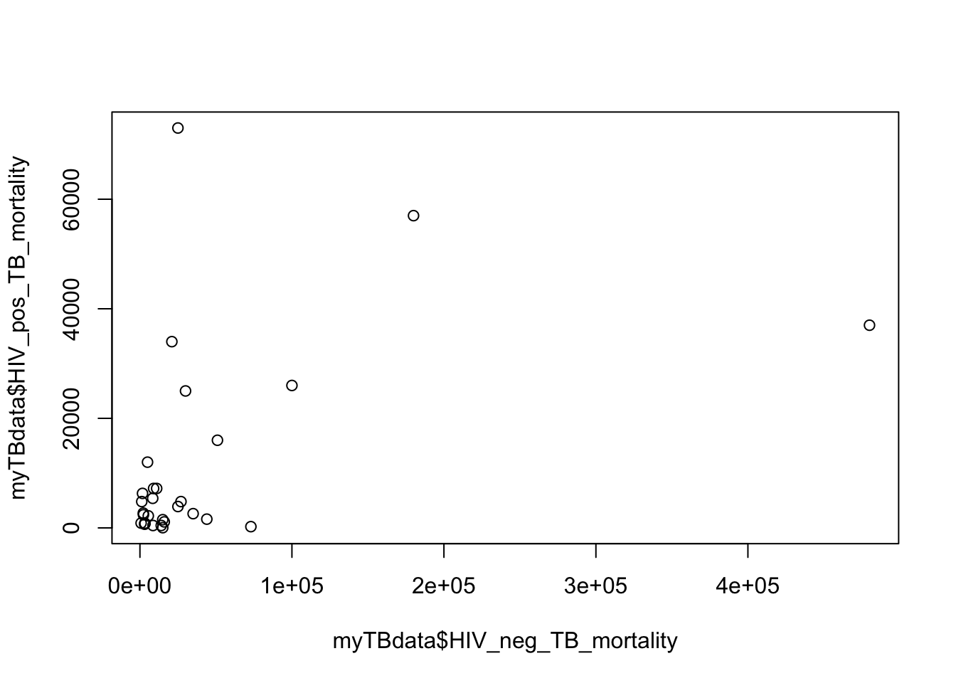
C. Add meaningful axes labels
plot(x=myTBdata$HIV_neg_TB_mortality,
     y=myTBdata$HIV_pos_TB_mortality,
     xlab="Mortality in HIV negative people",
     ylab="Mortality in HIV positive people")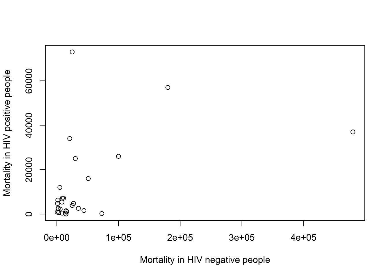
D. Add a meaningful title
plot(x=myTBdata$HIV_neg_TB_mortality,
     y=myTBdata$HIV_pos_TB_mortality,
     xlab="Mortality in HIV negative people",
     ylab="Mortality in HIV positive people",
     main="Comparison of mortality in HIV negative and positive")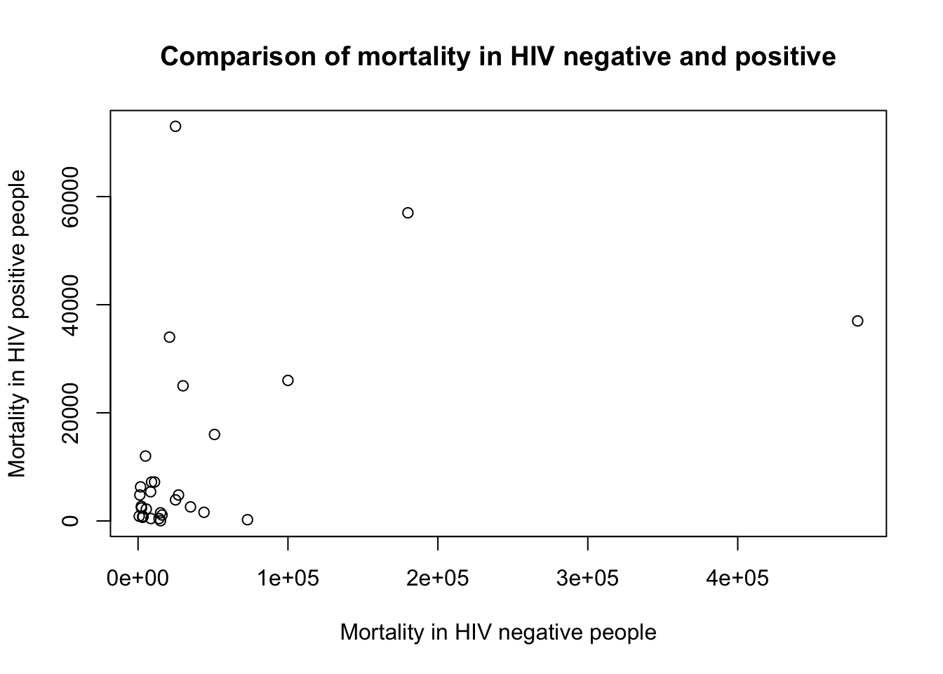
E. Change the colour of the points to red
plot(x=myTBdata$HIV_neg_TB_mortality,
     y=myTBdata$HIV_pos_TB_mortality,
     xlab="Mortality in HIV negative people",
     ylab="Mortality in HIV positive people",
     main="Comparison of mortality in HIV negative and positive",
     col="red")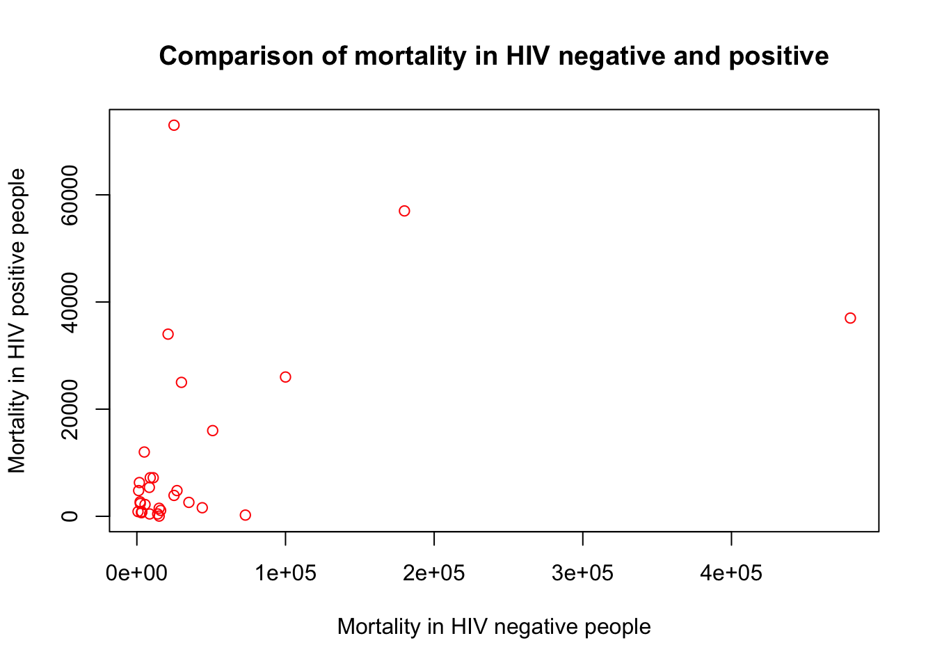
F. It’s hard to see the numbers because some are small and some very large
Using a log scale is useful for that.You can either log the values and re-plot, or use the log option in plot()
plot(x=myTBdata$HIV_neg_TB_mortality,
     y=myTBdata$HIV_pos_TB_mortality,
     xlab="Mortality in HIV negative people",
     ylab="Mortality in HIV positive people",
     main="Comparison of mortality in HIV negative and positive",
     col="red",
     log="xy")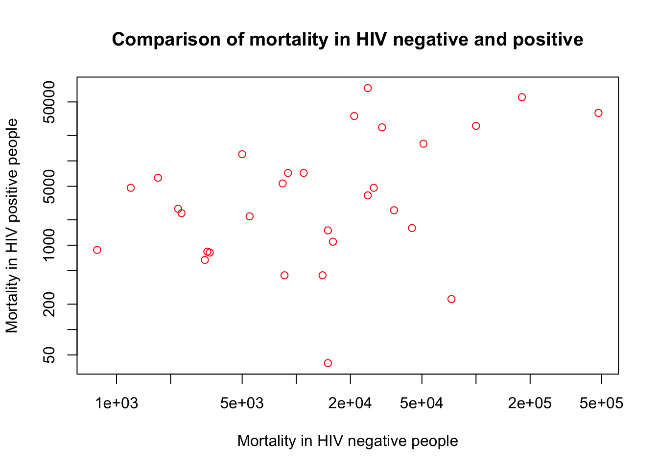
G. Now let’s make a different kind of plot
Show the distribution of Total_TB_mortality in a histogram and then change the x axis label. Note, same options as before.
hist(myTBdata$Total_TB_mortality)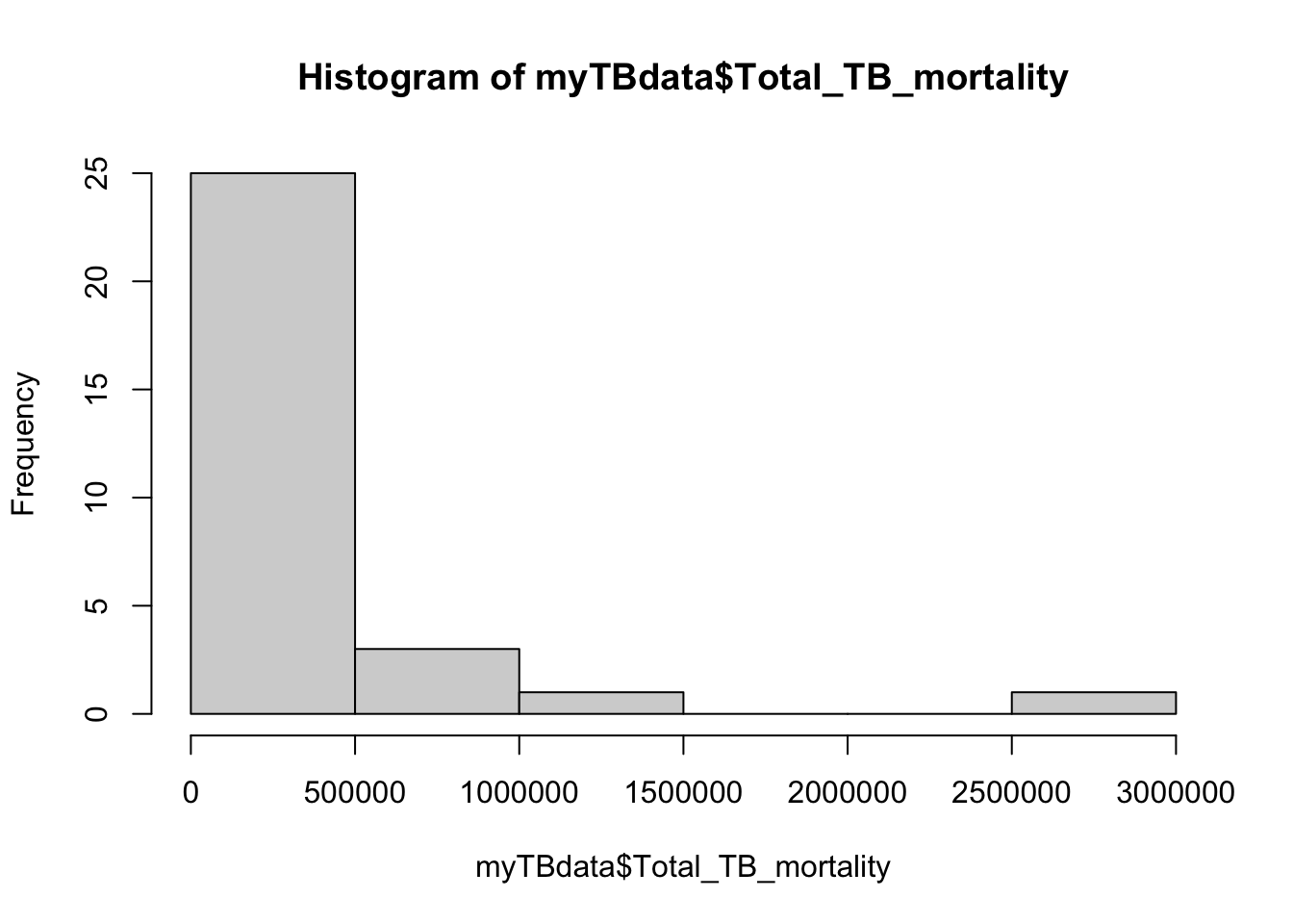
hist(myTBdata$Total_TB_mortality,
     xlab="Number")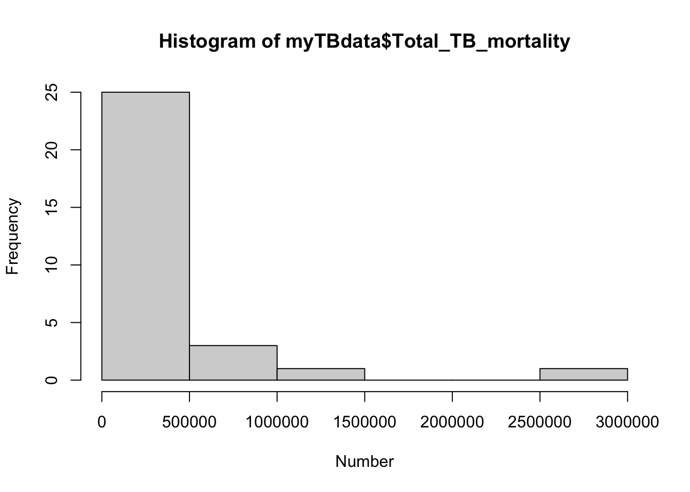
Now add a meaningful title to the plot
hist(myTBdata$Total_TB_mortality,
     xlab="Number",
     main = "Total TB mortality")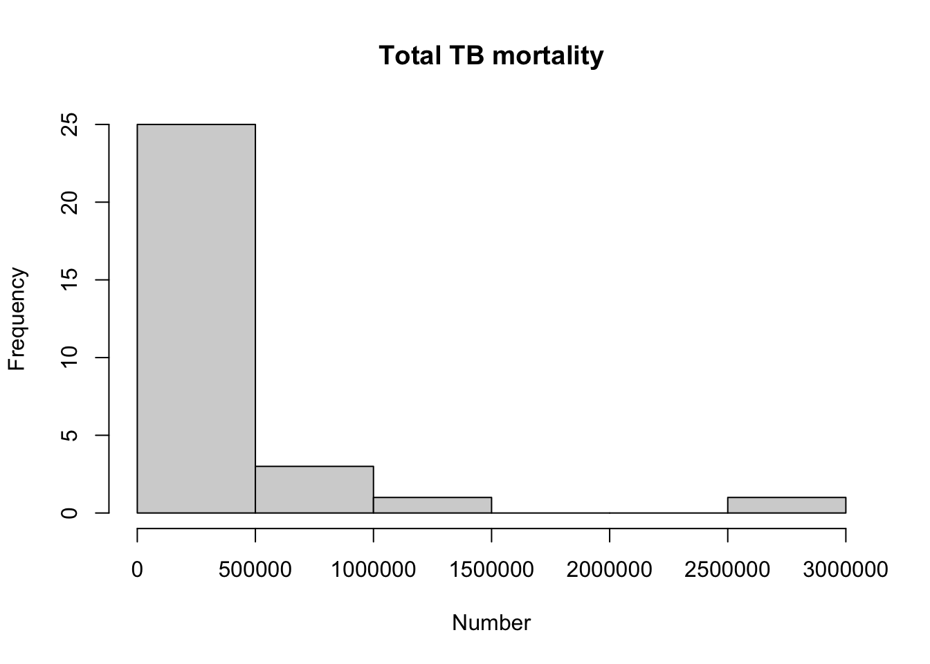
H. Check what other aspects of the histogram you can change
?histThen change the color to “blue” in the last plot
hist(myTBdata$Total_TB_mortality,
     xlab="Number",
     main="Total TB mortality",
     col="blue")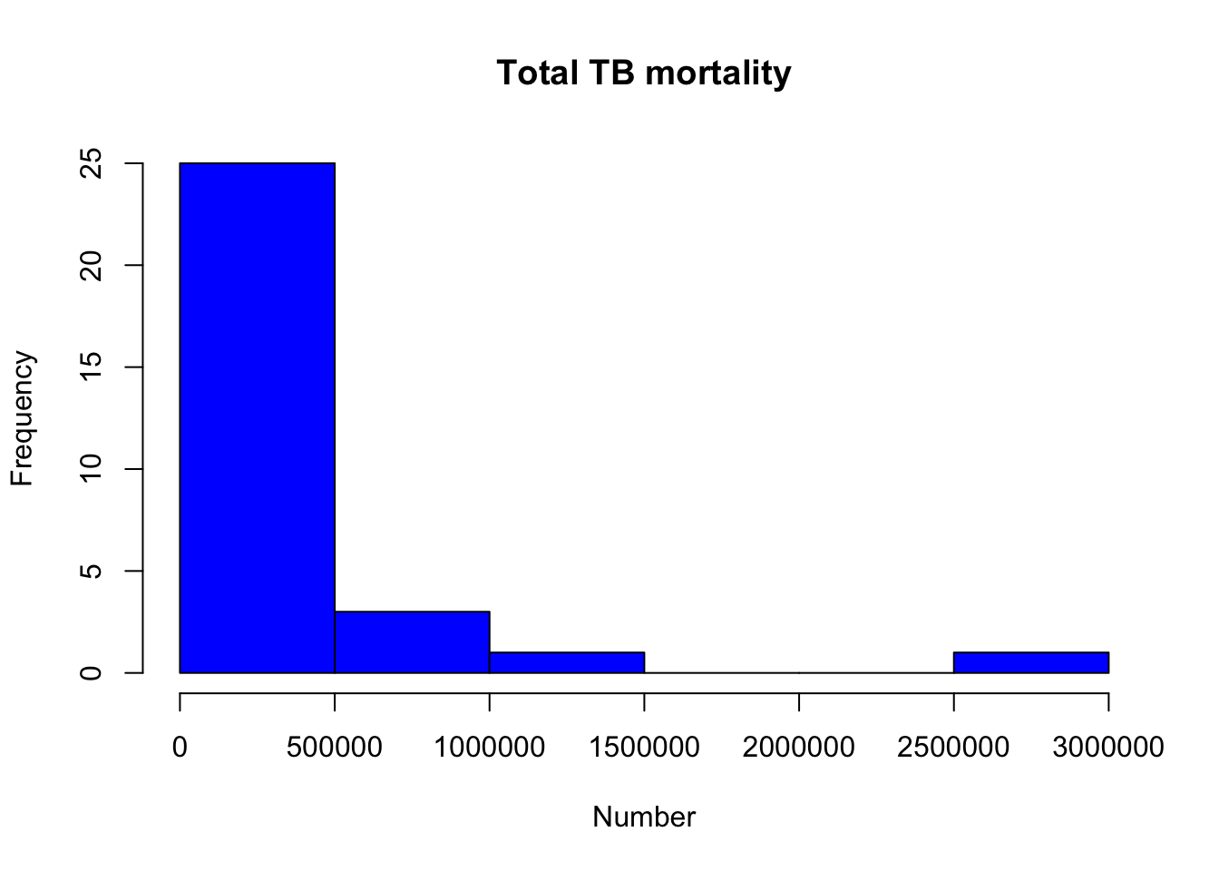
I. Now let’s plot a histogram of mortality per 1000
And add a title, and x axis label.
Hint: calculate it as in the previous practical
myTBdata[,"MortalityPer1000"] <- myTBdata[,"Total_TB_mortality"]*1000/myTBdata[,"Population"]
hist(myTBdata$MortalityPer1000,
     xlab = "Mortality per 1000",
     main = "TB mortality per 1000 population")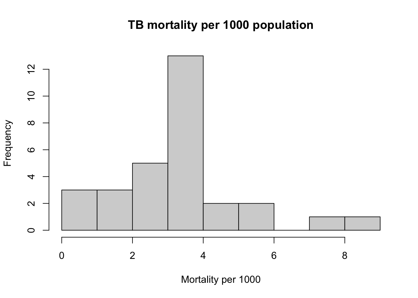
change the color to something different hint: to find more colours, run “colors()” or google “Colors in R”
hist(myTBdata$MortalityPer1000,
     xlab = "Mortality per 1000",
     main = "TB mortality per 1000 population",
     col = "dodgerblue1")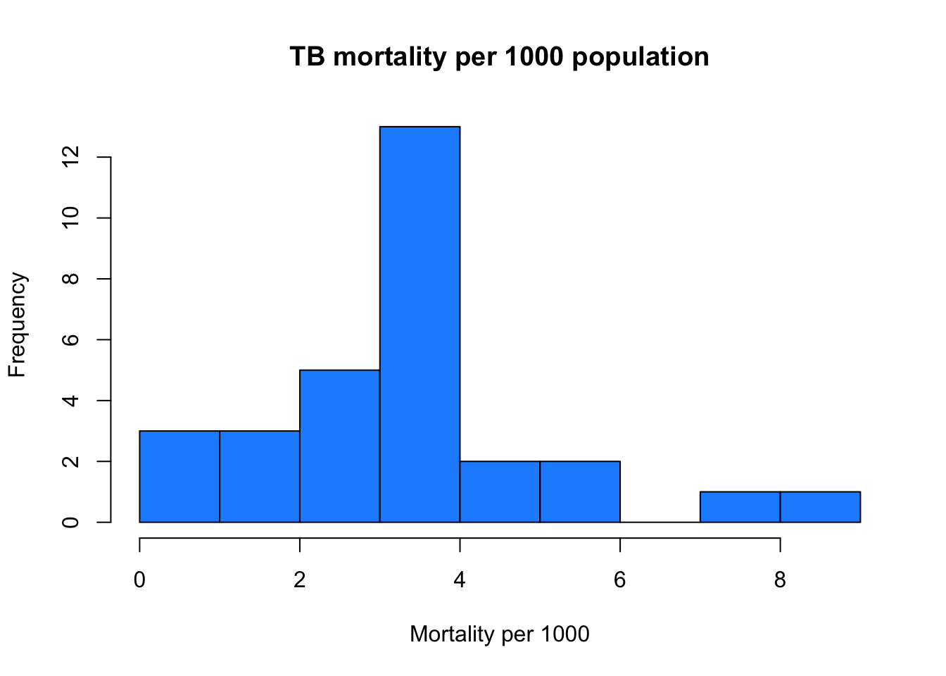
J. Now let’s show both histograms at the same time you need to make a call to “par”, short for parameters, setting the plot parameter “mfrow” (Multi-Figure ROW-wise) gives 1 row, and 2 columns of plot
par(mfrow=c(1,2))
hist(myTBdata$Total_TB_mortality,
     xlab="Number",
     main="Total TB mortality",
     col="blue")

hist(myTBdata$MortalityPer1000,
     xlab = "Mortality per 1000",
     main = "TB mortality per 1000 population",
     col = "dodgerblue1")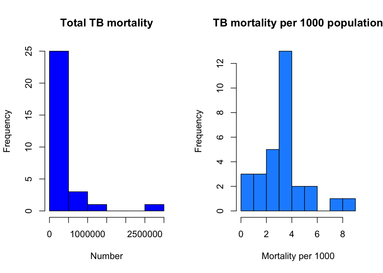
cut and paste your plot code from I. here and run it. Then resize the plot window and see what happens
K. Export the figure and save it as a PNG with a useful name
Hint: use the Export button in the plot window
L. R has functions for every kind of plot for example:
?barplot
?boxplot
?contour
and stackoverflow.com has a lot of comments and help on every kind of plot
Advanced plotting exercises
Make a plot where:
x=Total_TB_mortality and y=HIV_pos_TB_mortality
both aces are on the on the log scale
colour the points
add axis labels and a title
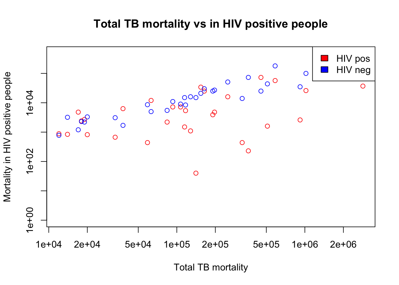
plot(x=myTBdata$Total_TB_mortality,
     y=myTBdata$HIV_pos_TB_mortality,
     xlab="Total TB mortality",
     ylab="Mortality in HIV positive people",
     main="Total TB mortality vs in HIV positive people",
     col="red",
     log="xy")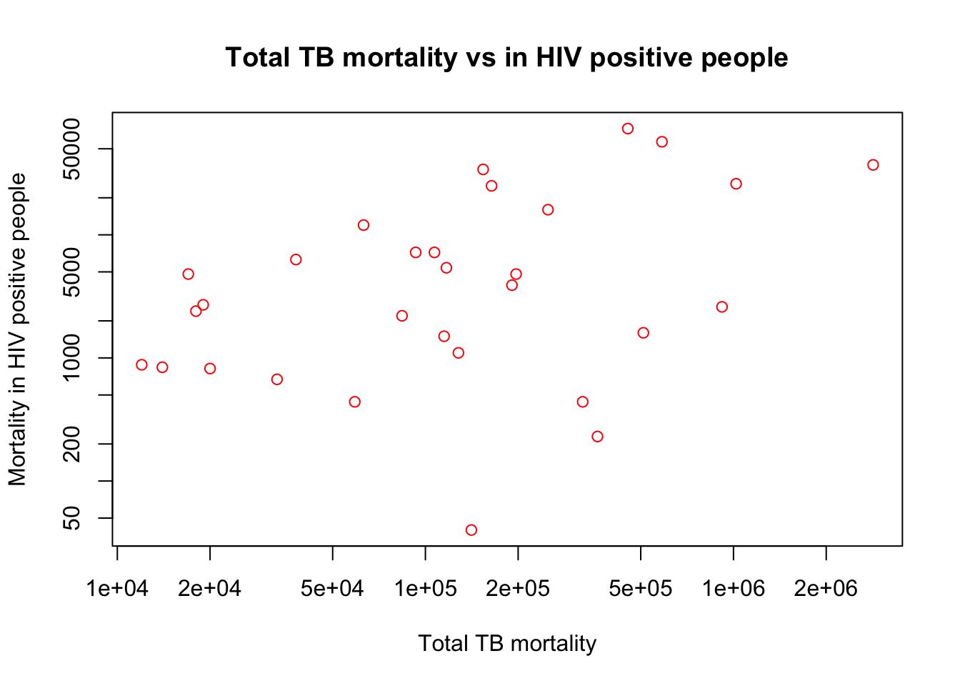
add HIV_neg_TB_mortality on the same y axis, in a different colour.
Hint: use points(). see ?points for information
plot(x=myTBdata$Total_TB_mortality,
     y=myTBdata$HIV_pos_TB_mortality,
     xlab="Total TB mortality",
     ylab="Mortality in HIV positive people",
     main="Total TB mortality vs in HIV positive people",
     col="red",
     log="xy")
points(x=myTBdata$Total_TB_mortality,
       y=myTBdata$HIV_neg_TB_mortality,
     col="blue")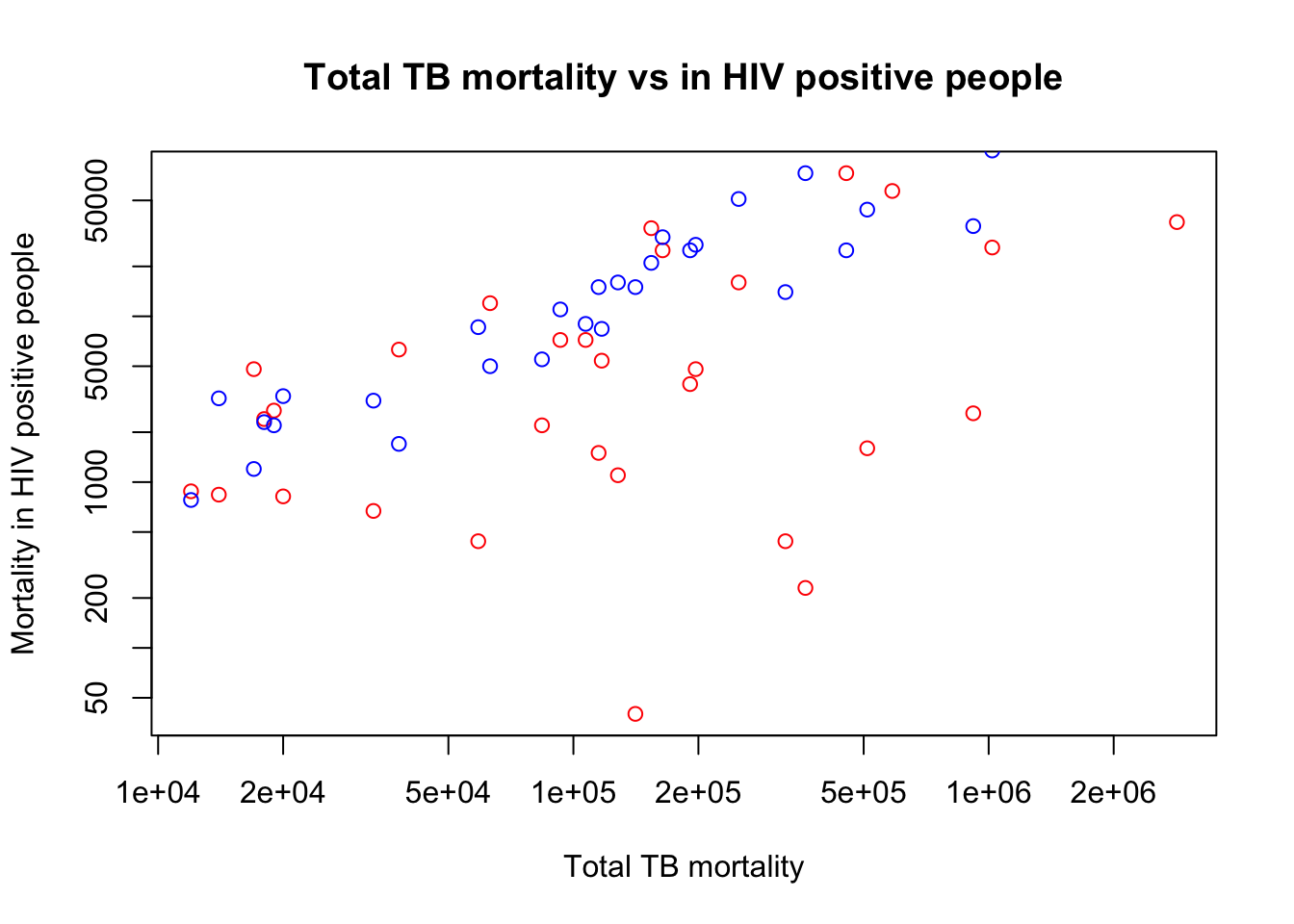
do you need to change the y axis label? i.e. does it still make sense now that it shows negative and positive mortality?
Answer: You’ll need to change the y axis label.
Some of the points no longer fit on the graph. Why is this? You need to alter the y limit (ylim), which is an option of plot. What value will you choose?
Hint: the maximum value that the data go to change the ylim of the plot.
plot(x=myTBdata$Total_TB_mortality,
     y=myTBdata$HIV_pos_TB_mortality,
     xlab="Total TB mortality",
     ylab="Mortality in HIV positive people",
     main="Total TB mortality vs in HIV positive people",
     col="red",
     log="xy",
     ylim=c(1, max(myTBdata$HIV_neg_TB_mortality, myTBdata$HIV_pos_TB_mortality)))
points(x=myTBdata$Total_TB_mortality, y=myTBdata$HIV_neg_TB_mortality,
       col="blue")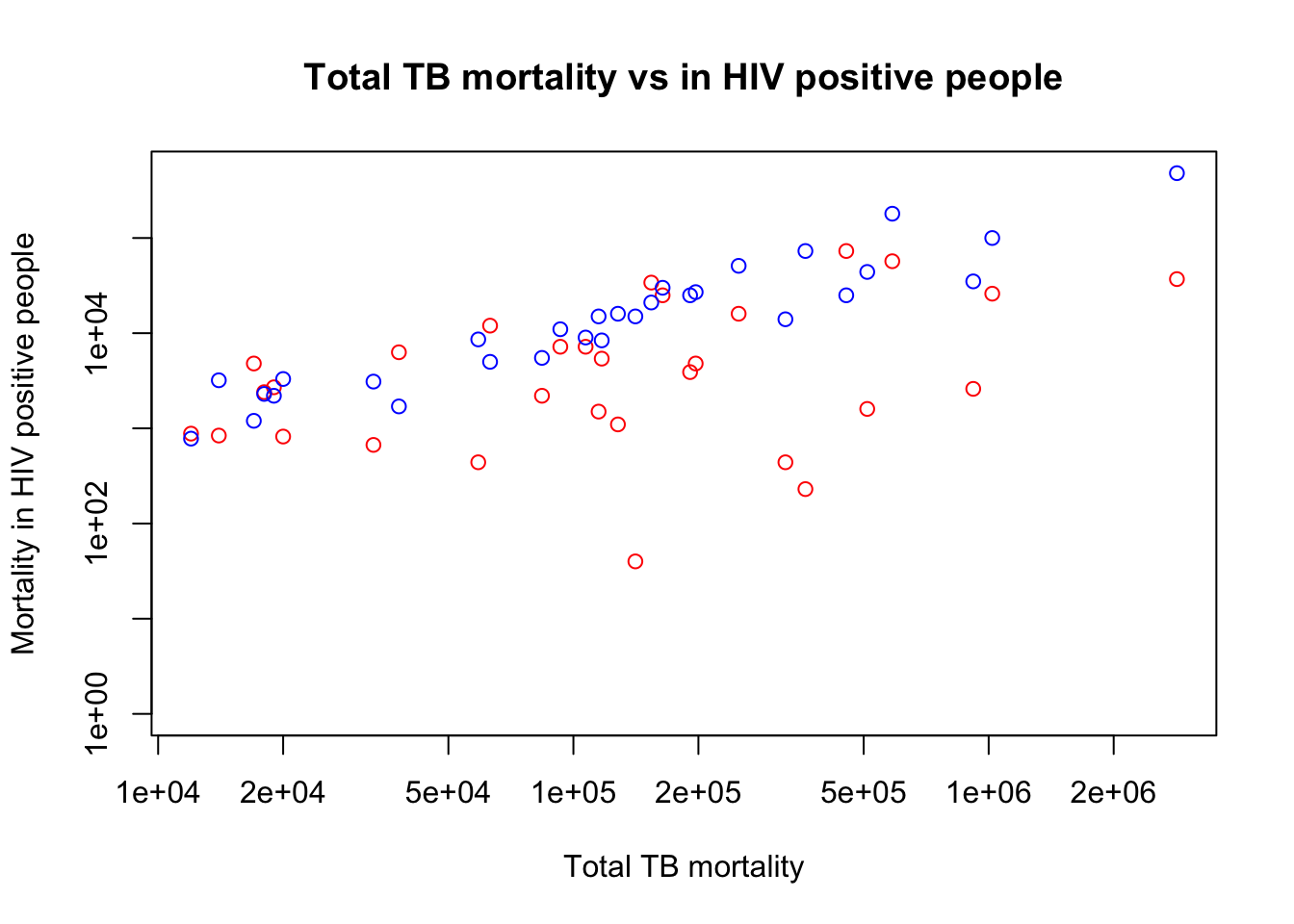
The plot now has 2 data sets in different colours, so it needs a legend check the help of legend (there’s a lot of options!)
Hint: use x=“topright” instead of setting the x and y values for location.
Hint: use the option “fill” to change the colours
plot(x=myTBdata$Total_TB_mortality,
     y=myTBdata$HIV_pos_TB_mortality,
     xlab="Total TB mortality",
     ylab="Mortality in HIV positive people",
     main="Total TB mortality vs in HIV positive people",
     col="red",
     log="xy",
     ylim=c(1, max(myTBdata$HIV_neg_TB_mortality, myTBdata$HIV_pos_TB_mortality)))
points(x=myTBdata$Total_TB_mortality, y=myTBdata$HIV_neg_TB_mortality,
       col="blue")
legend(x="topright", legend=c("HIV pos", "HIV neg"), fill=c("red", "blue"))