Changing travel patterns in China during the early stages of the COVID-19 pandemic
Abstract: Understanding changes in human mobility in the early stages of the COVID-19 pandemic is crucial for assessing the impacts of travel restrictions designed to reduce disease spread. Here, we investigated the spatio-temporal characteristics of human mobility between 1st January and 1st March 2020. Relying on a range of techniques from trajectory clustering to network analysis, we examined human movement on multiple geographic scales to provide a complete picture of the overall dynamics while drawing links to their public health implications. An outbound travel surge from Wuhan before travel restrictions were implemented was also observed across China due to the Lunar New Year, indicating that holiday travel may have played a larger role in mobility changes compared to impending travel restrictions. Holiday travel also shifted healthcare pressure related to COVID-19 towards locations with lower access to care. Network analyses showed no sign of major changes in the transportation network after Lunar New Year. Changes observed were temporary and have not yet led to structural reorganisation of the transportation network at the time of this study.
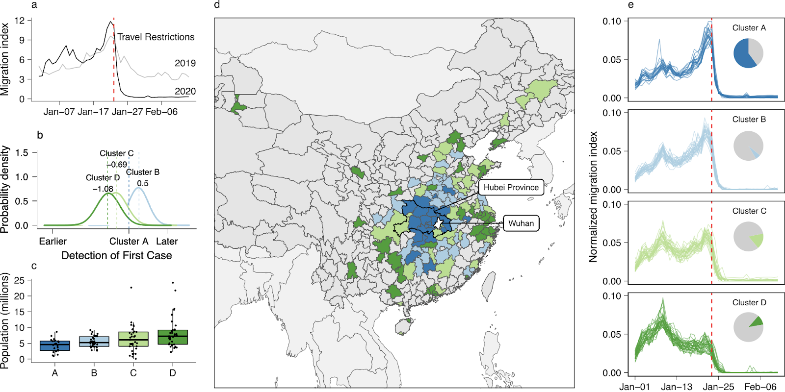 Figure 1. Travel patterns between Wuhan and its neighbors. The identified patterns of outbound travel from Wuhan: a), the daily outbound travel from Wuhan in 2019 and 2020; b), relative timing of first case detection stratified by clusters of similar trajectories, using Cluster A as the baseline. The distribution shows the mean effect size adjusted for surveillance intensity; c), distribution of resident population sizes of individual prefectures (points); d), map of prefectures and province-level cities showing the spatial distribution of trajectory clusters; e), outbound travel trends from Wuhan to the most connected prefectures in China, stratified by clusters of similar trajectories. The trajectories have been normalised by the total flow of each, to allow comparison of the profile. The pie charts show the total flux out of Wuhan prefecture by destinations in each cluster.
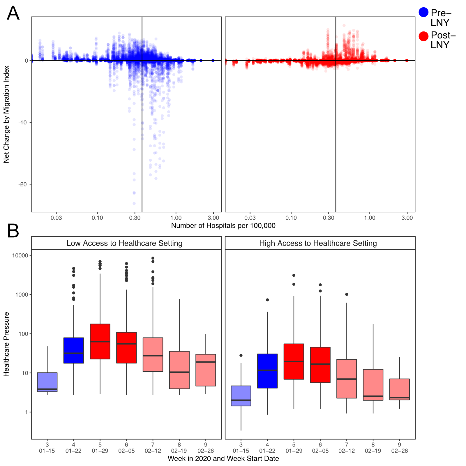 Figure 3. Human mobility, healthcare services availability, and COVID-19 related healthcare pressure. A), The changes in traveller volume before (blue) and after (red) LNY. Net change is defined as inbound migration index minus outbound migration index. Thus, a negative change indicates more travellers leave than arrive while a positive value indicates more travellers arrive than leave. Solid line indicates the median level of healthcare access. B), The changes in the healthcare pressure (log10 scale) related to COVID-19 each week in low and high healthcare access prefectures. Healthcare access is measured by the number of hospitals per 100,000 residents. Healthcare pressure is measured by confirmed COVID-19 cases divided by healthcare access. Darker shade represents weeks when low healthcare access settings experienced significantly higher pressure than high healthcare access settings; lighter shade represents when differences are not significant based on Mann-Whitney U test.
Read the published article here. An earlier pre-print and supplemental materials also available.